Description
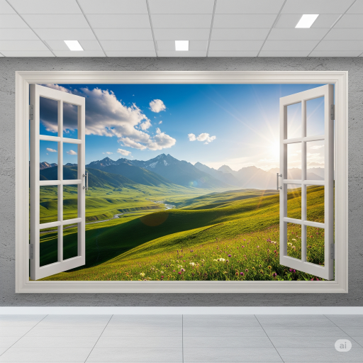
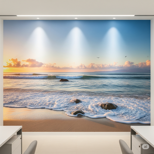
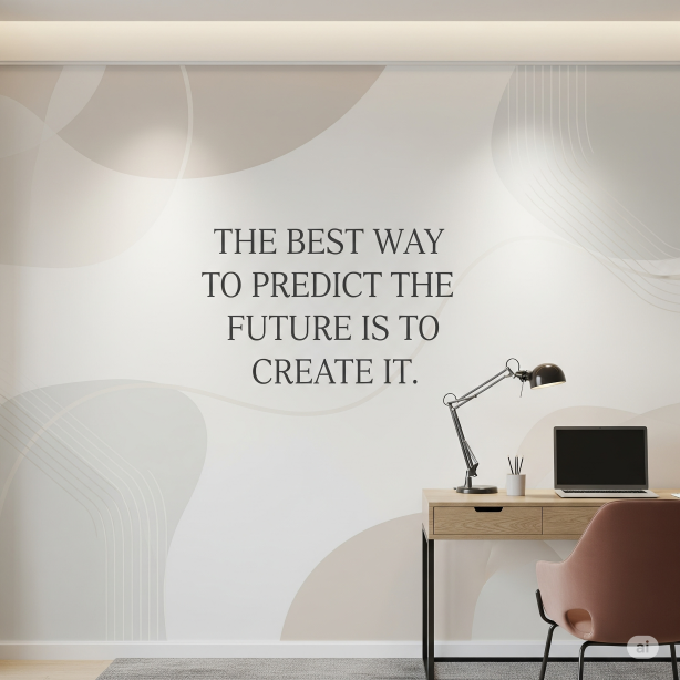
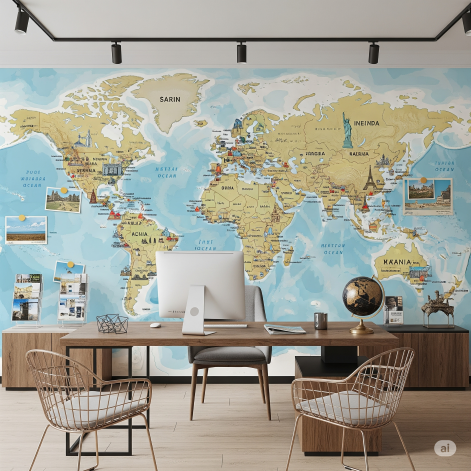
Wallpaper for Office Space
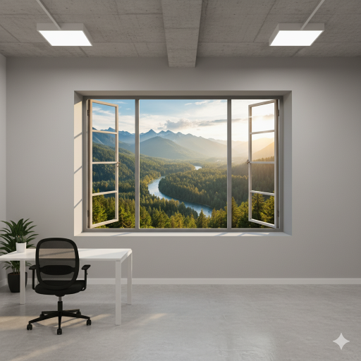
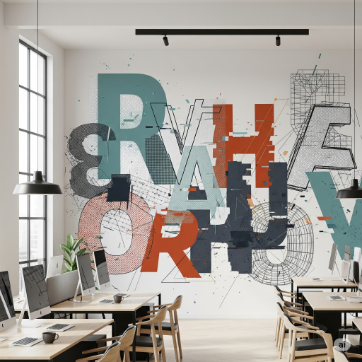
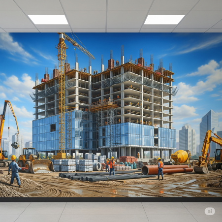
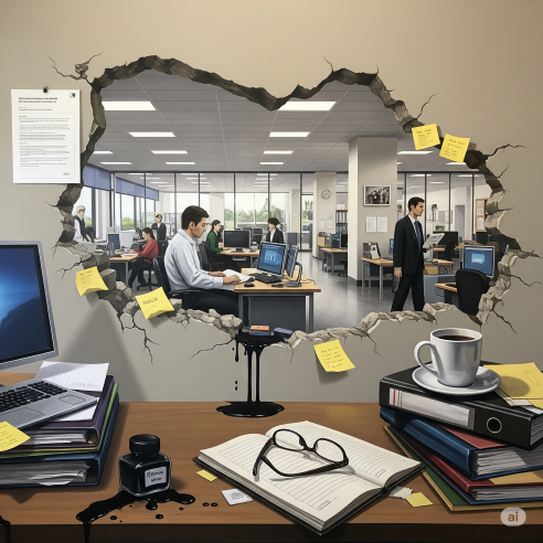
Wallpaper for office interior design/ decoration has become a sophisticated design choice that impacts everything from first impressions to daily productivity.
Here is an overview covering the benefits, drawbacks, material considerations, and the impact of color.
1. Benefits
Wallpaper for office space offers significant advantages over standard paint, especially in commercial settings:
Aesthetics & Brand Identity
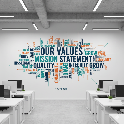
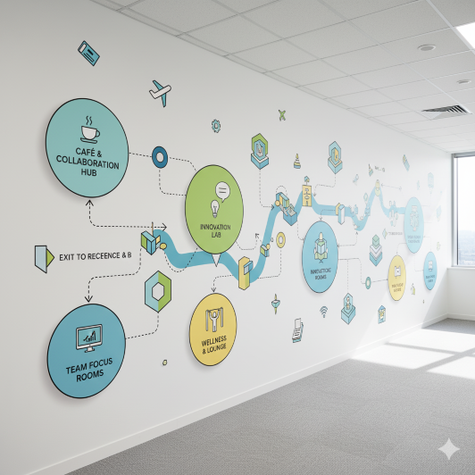
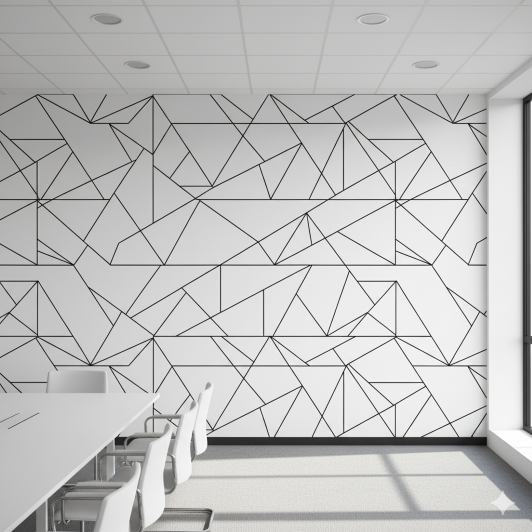
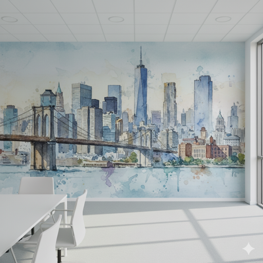
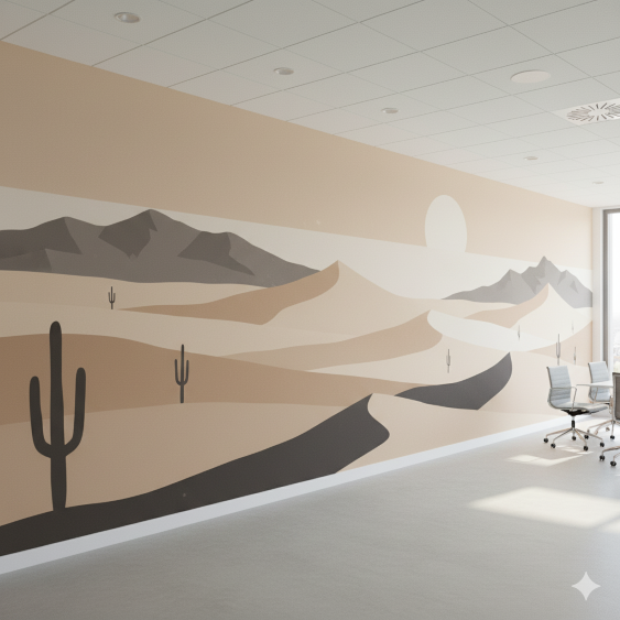
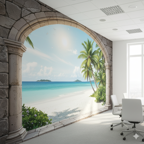
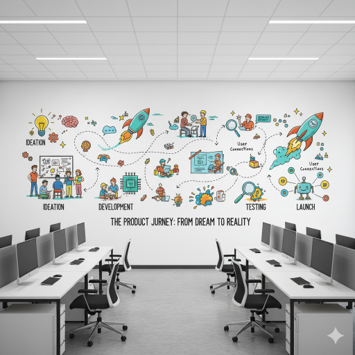
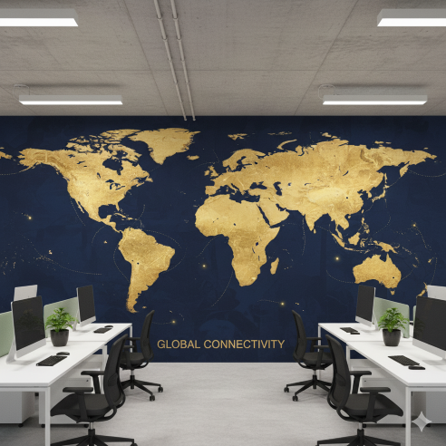
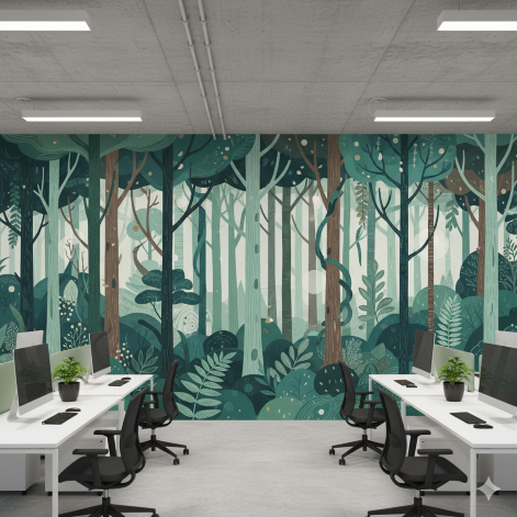
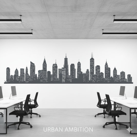
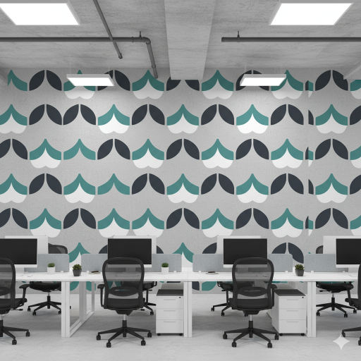
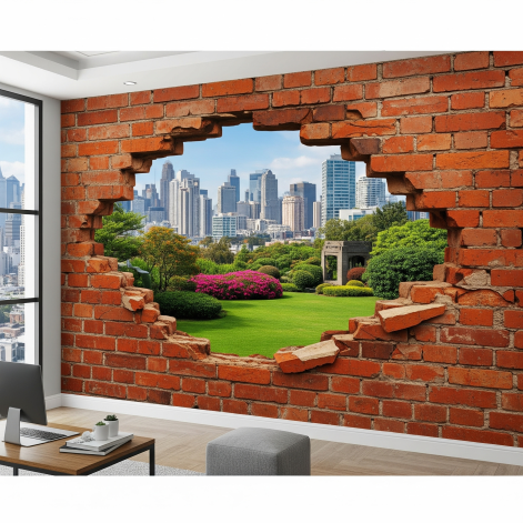
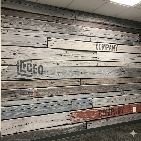
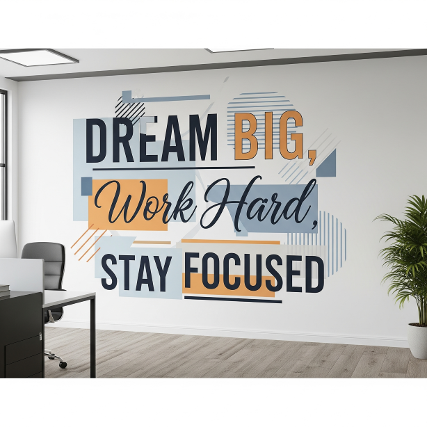
Wallpaper provides depth, texture, and the ability to use large-scale murals or intricate patterns that immediately communicate a company’s culture, professionalism, and modernity.
Durability & Longevity
High-quality commercial wallpaper (especially vinyl) is significantly more durable than paint, resisting scuffs, scratches, and stains. It can last 15 years or more, outlasting several paint jobs and saving on maintenance costs over time.
Easy Maintenance
Commercial-grade papers are often washable and scrubbable, allowing for easy cleaning of fingerprints and marks in high-traffic areas like lobbies and hallways.
Acoustic Improvement
Specialized acoustical wallcoverings use layered materials to help reduce sound transfer and echo, improving meeting clarity and focus in open-plan offices.
Conceals Imperfections
Wallpaper does a better job of hiding minor wall imperfections (bumps, small cracks) than paint.
Energy Efficiency
Office wall coverings often have a higher R-value, acting as insulators that can contribute to lower energy bills.
2. Drawbacks and Considerations
While beneficial, wallpaper requires careful planning:
Higher Initial Cost
Both the material and professional installation are generally more expensive upfront than a standard coat of paint.
Installation Complexity
Proper installation, including wall preparation (sanding, patching), measuring, and pattern matching, requires skilled professionals and takes longer than painting.
Removal Difficulty
Removing old wallpaper can be time-consuming and labor-intensive, potentially damaging the underlying wall surface if done improperly.
Moisture Sensitivity
Certain types (non-vinyl) can peel, warp, or grow mildew if exposed to high humidity or leaks.
Design Overload
Bold patterns must be chosen carefully; an overwhelming design can dominate the space and cause visual fatigue or distraction.
3. Commercial Material Grades & Types
In an office, commercial-grade wallpaper is essential for performance. These are typically graded based on durability:
| Grade Type | Typical Weight (oz/linear yd) | Best For | Key Features |
| Type I | 12–19 oz | Low-traffic areas, private offices. | More economical, still durable, but less resistant to heavy impact. |
| Type II | 20–29 oz | Most common for general office use (hallways, meeting rooms). | Highly durable, washable, stain-resistant, excellent balance of cost and longevity. |
| Type III | 33–36 oz | Extremely high-traffic areas (e.g., hospital corridors). | Strongest protection against abrasion, usually more expensive. |
Popular Commercial Materials Include:
Vinyl
The industry standard, known for superior durability, scrubbability, and resistance to tears.
Textile/Fabric-Backed
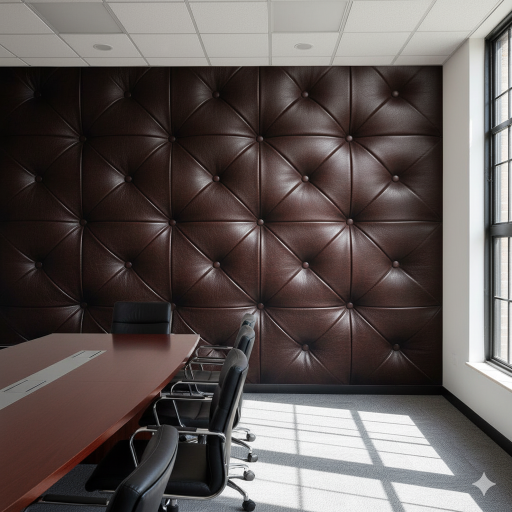
Offers a luxurious, tactile feel (like linen or grasscloth) but may be reserved for lower-traffic areas.
Acoustical Coverings
Specifically engineered to absorb sound, crucial for open offices.
Dry Erase/Writable Coverings
Functional vinyl or polyester laminates that allow the wall to double as a whiteboard.
4. Wallpaper for Office Color Psychology and Productivity
The color of your office wallpaper directly influences mood, energy, and focus:
| Color | Psychological Effect | Best Office Use | Caution |
| Blue | Calmness, trust, focus, reliability. | Task-oriented areas, meeting rooms, client-facing reception areas. | Too cool or dark can feel cold or induce sluggishness. |
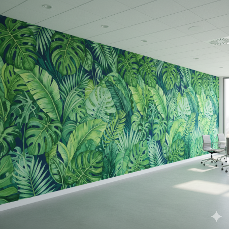
| Green | Balance, harmony, stress reduction, growth. | Workstations, collaborative spaces, areas needing focus and creativity. | Best in soft, balanced hues. |
| Yellow | Optimism, energy, creativity, motivation. | Brainstorming rooms, creative hubs, break areas. | Too bright can cause eye strain or overstimulation. |
| Orange | Cheerfulness, sociability, energy, enthusiasm. | Break rooms, collaboration zones where interaction is key. | Overuse can lead to frustration or agitation. |
| Gray/Neutral | Professionalism, stability, modern backdrop. | Executive suites, general administrative areas. | Too much grey/beige/white without accents can induce sadness or a bland feel. |
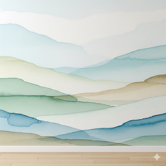
The Blue Wallpaper for Office Space
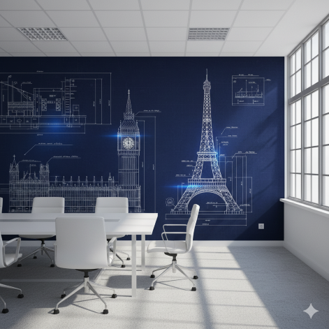
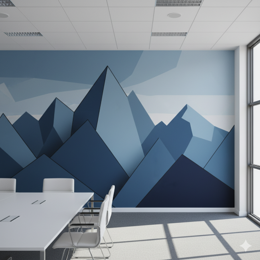
Blue wallpaper is an excellent choice for many office environments due to the powerful psychological effects associated with the color.
Here is a detailed breakdown of why blue is highly recommended for office spaces:
Blue Wallpaper Promotes Calmness and Reduces Stress
Blue is universally associated with the serenity of the sky and the ocean. In a work context, this translates to:
Lowered Stress
Studies suggest that blue environments can help lower heart rate and blood pressure, leading to reduced stress levels among employees.
Peaceful Atmosphere
It creates a calming and stable atmosphere, which is vital for preventing burnout and maintaining mental well-being during demanding work periods.
Enhances Focus and Concentration
The tranquil nature of blue directly supports cognitive tasks that require sustained attention:
Improved Focus
Blue is consistently cited as a color that aids concentration and efficiency. It helps employees stay focused on detailed or analytical tasks without easily becoming distracted.
Mental Clarity
It promotes a sense of order and encourages a logical, thoughtful mind, making it ideal for analytical or task-oriented roles.
Symbolizes Trust and Professionalism
Blue is a core color for many major corporate brands for a reason—it conveys dependability:
Trustworthiness
Shades of blue evoke feelings of reliability, confidence, and honesty. This makes blue wallpaper an excellent choice for client-facing areas like reception lobbies or boardrooms where projecting a secure image is crucial.
Professionalism
Darker shades, like navy, convey seriousness and authority, while lighter shades maintain a clean, professional look.
Stimulates Creativity (In Moderation)
While often seen as a “cool” color, certain shades of blue can also boost creative thought:
Creativity and Hope
Blue is linked to mental clarity and hope, which can foster the right mental state for creative problem-solving, especially when paired with a lighter, more vibrant shade.
Important Considerations for Using Blue Wallpaper in the Office
While highly beneficial, blue must be used thoughtfully:
Avoid Overuse/Too Cold
Too much dark or overly cool blue can make a space feel cold, distant, or even sad (“feeling blue”).
Balance with Warmth
To keep the space inviting, balance the blue with warmer elements like natural wood textures, soft white trim, or pops of yellow/orange in furniture or décor.
Shade Matters
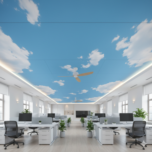
Lighter, brighter blues (like sky blue) tend to be more energizing, while deeper blues promote deep focus. Choose the shade that best matches the room’s primary function.
Food Industry Note
Blue is known to suppress appetite and is generally considered unappetizing, so it’s usually avoided in office kitchens or cafeterias.
In summary, blue wallpaper is excellent for offices that require high levels of concentration, stability, trust, and a low-stress environment.
The best wallpaper for office space: Customization
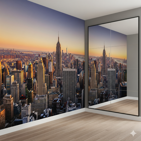
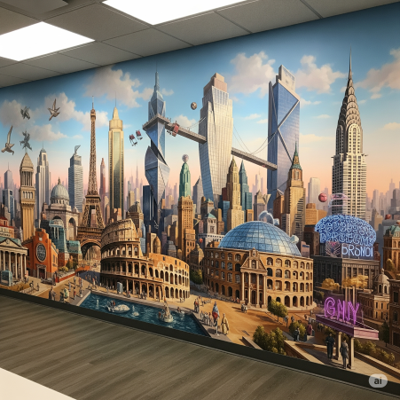
Customizing office wallpaper transforms it from a simple covering into a powerful strategic tool. Follow these steps for the best result:
Define Your Goal & Brand
Determine the wall’s purpose (e.g., inspiring collaboration, reinforcing trust, setting a creative tone). Ensure your chosen imagery, colors, and patterns align perfectly with your company’s identity and values.
Select the Location
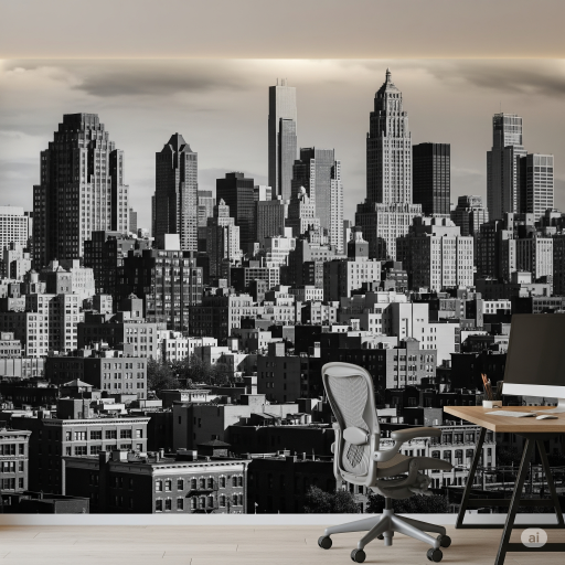
Choose a focal wall—the first one seen upon entry or the backdrop for video calls. This ensures maximum impact and avoids distracting smaller areas.
Choose High-Quality Artwork
If using a mural, source or create a high-resolution image. For print, PDF, TIFF, or high-quality JPEG files at 300 DPI are generally required to avoid pixelation when scaled large. Ensure all fonts are outlined.
Select Material & Finish
For offices, prioritize commercial-grade vinyl (Type II) for durability and scrubbability. Choose a matte or low-sheen finish to minimize screen glare.
Mock-Up and Finalize
Before printing, ask the supplier for a digital proof or a large sample. Tape mock-ups on the actual wall to test them under different lighting conditions.
By focusing on brand message, high-quality assets, and durable materials, you customize a space that works for your business.
Would you like me to suggest specific high-impact mural themes based on an industry (like tech or finance)? Call us at 0720271544.

